Relations Diagram (or Interrelationship Digraph)
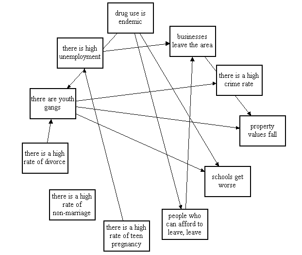
Relations Diagrams are drawn to show all the different relationships between factors, areas, or processes. Why are they worthwhile? Because they make it easy to pick out the factors in a situation which are the ones which are driving many of the other symptoms or factors. For example, a relations diagram of urban poverty might start out something like this:

Instead of one item following another in a logical sequence, each item is connected to many other pieces, showing that they have an impact on each one. Once all the relevant connections between items have been drawn, the connections are counted. Those with the most connections will usually be the most important factors to focus on.
While the relations diagram is one of the 7 New QC Tools described in the Japanese classic "Management for Quality Improvement", it is less frequently used than some of its stablemates. However, in a fairly tangled situation, it is a powerful means of forcing a group to map out the interactions between factors, and usually helps bring the most important issues into focus.
To create a Relations Diagram:
- Agree on the issue or question.
- Add a symbol to the diagram for every element involved in the issue.
- Compare each element to all others. Use an "influence" arrow to connect related elements.
- The arrows should be drawn from the element that influences to the one influenced.
- If two elements influence each other, the arrow should be drawn to reflect the stronger influence.
- Count the arrows.
- The elements with the most outgoing arrows will be root causes or drivers.
- The ones with the most incoming arrows will be key outcomes or results.

