
Run Charts
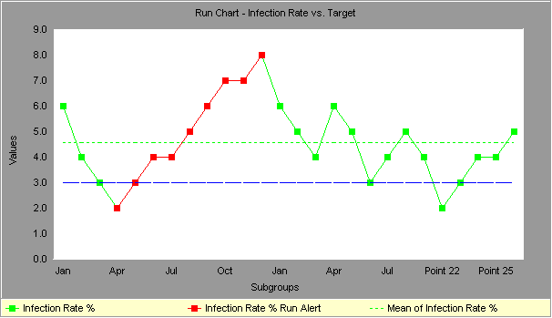
Run charts (often known as line graphs outside the quality management field) display process performance over time. Upward and downward trends, cycles, and large aberrations may be spotted and investigated further. In a run chart, events, shown on the y axis, are graphed against a time period on the x axis. For example, a run chart in a hospital might plot the number of patient transfer delays against the time of day or day of the week. The results might show that there are more delays at noon than at 3 p.m. Investigating this phenomenon could unearth potential for improvement. Run charts can also be used to track improvements that have been put into place, checking to determine their success. Also, an average line can be added to a run chart to clarify movement of the data away from the average.
Alternatives with run charts:
- An average line, representing the average of all the y values recorded, can easily be added to a run chart to clarify movement of the data away from the average. An average line runs parallel to the x axis.
- Several variables may be tracked on a single chart, with each variable having its own line. The chart is then called a multiple run chart.
- Run charts can also be used to track improvements that have been put into place, checking their success.
Questions to ask about a run chart:
- Is the average line where it should be to meet customer requirements?
- Is there a significant trend or pattern that should be investigated?
Two ways to misinterpret run charts:
- You conclude that some trend or cycle exists, when in fact you are just seeing normal process variation (and every process will show some variation).
- You do not recognize a trend or cycle when it does exist.
Both of these mistakes are common, but people are generally less aware that they are making the first type, and are tampering with a process which is really behaving normally. To avoid mistakes, use the following rules of thumb for run chart interpretation:
- Look at data for a long enough period of time, so that a "usual" range of variation is evident.
- Is the recent data within the usual range of variation?
- Is there a daily pattern? Weekly? Monthly? Yearly?
Using run charts to detect "special causes" of variation:
If you have 25 points or more in your data series, you can use run charts to detect special causes - something beyond the usual variability of the process -acting on the process.
- Shifts: If you see eight or more consecutive points on one side of the center line, that indicates that a special cause has influenced the process. Points on the center line don't count; they neither break the string, nor add to it.
- Trends: Six consecutive jumps in the same direction indicate that a special cause is acting on the process to cause a trend. Flat line segments don't count, either to break a trend, or to count towards it.
- Pattern: If you see a pattern that recurs eight or more times in a row, it is a good idea to look for a special cause.
For more robust monitoring of a process, and better information about when your process is showing variation beyond what is expected, try using a control chart. It will detect special causes more quickly, and with more accuracy.
Run chart statistics:
For each line in the run chart, the following statistics are calculated:
| Mean | the average of all the data points in the series. |
| Maximum | the maximum value in the series. |
| Minimum | the minimum value in the series. |
| Sample Size | the number of values in the series. |
| Range | the maximum value minus the minimum value. |
| Standard Deviation | Indicates how widely data is spread around the mean |
Recommended Reading:

SkyMark is a software company based in Pittsburgh, Pennsylvania which focuses on creating software tools that help people improve the way they work.
Useful Links
2026 © SkyMark Corporation. All Rights Reserved.